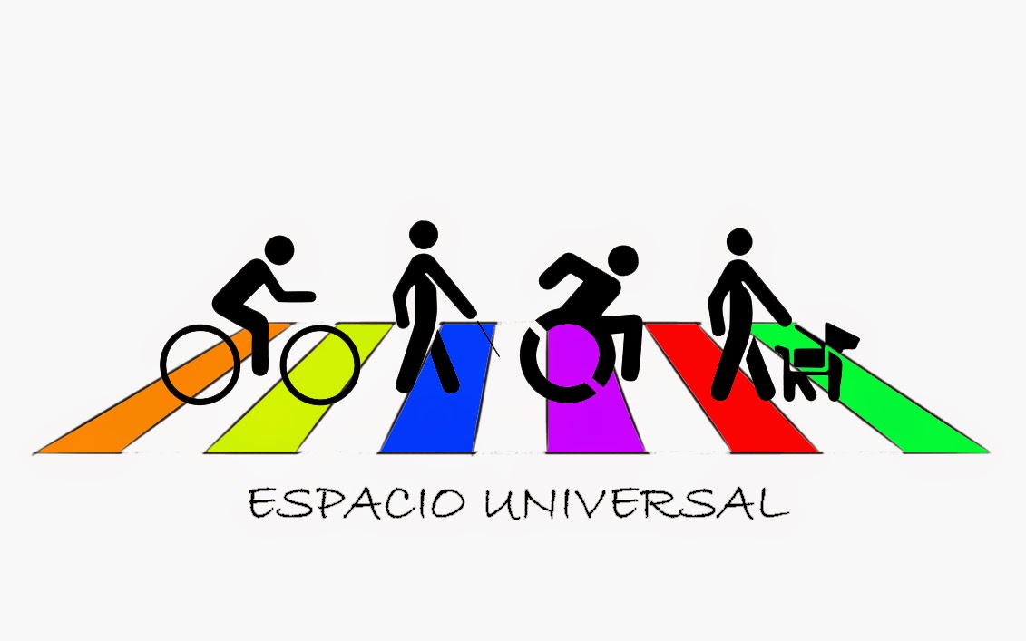
The Accessible Icon Project (2009 - Present)

It all started when...
In 2009 Sara Hendren (ABLER.COM) reported sightings of a tweaked disability symbol at the MoMA. We exchanged some comments towards creating our own symbol that was publicly accessible, and began working on design and implementation in 2010.

Accessible Icon 1.0
An orange cut-out-person overlaying the old symbol on signs to express the personhood of persons with disability.
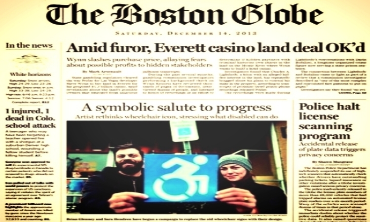
Design-wise, this did not work, so Sara designed our first orange "double-wheel" version with a grant from the Awesome Foundation, and created transparent stickers to place on disability signs around the greater Boston area in 2011, as covered by The Boston Globe.

Accessible Icon 2.0
A transparent orange symbol of a person in a chair to express personhood, leaning forward with a double wheel to suggest movement.
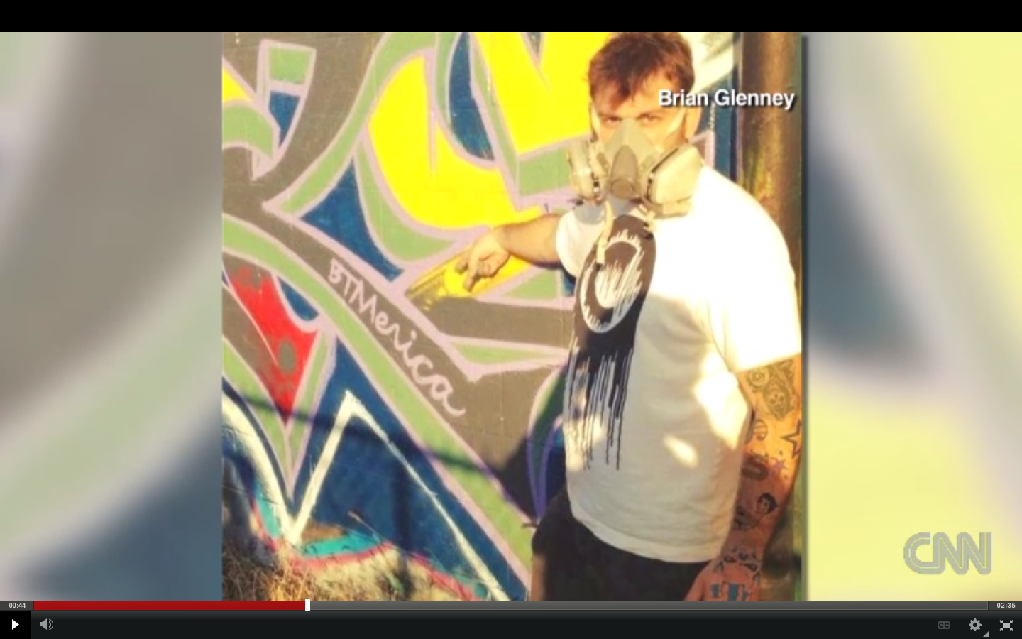
In 2012, our work began to shift away from a "guerrilla campaign" towards more institutionalized activism, our friend Tim Ferguson Sauder created a final blue version based around the ISO 50 "bathroom symbols."

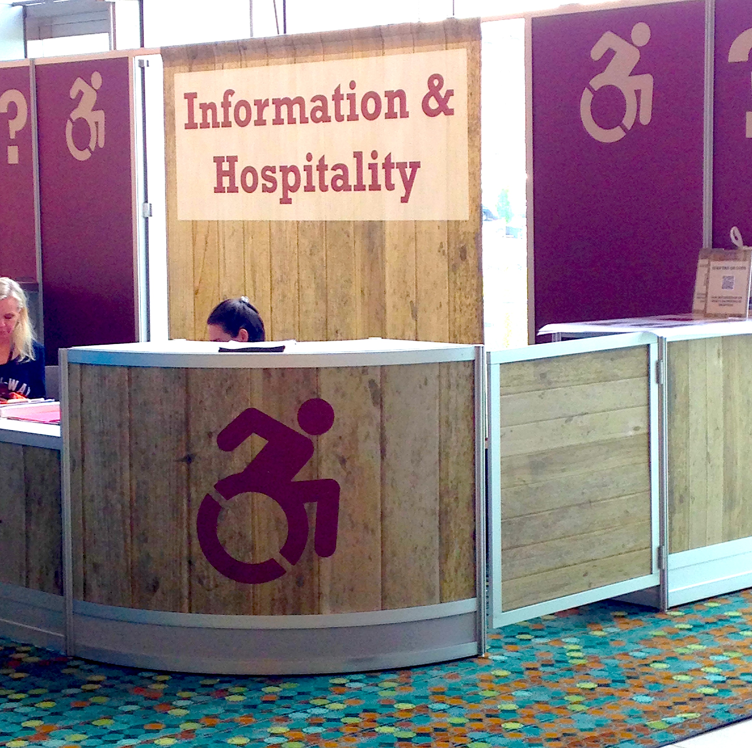
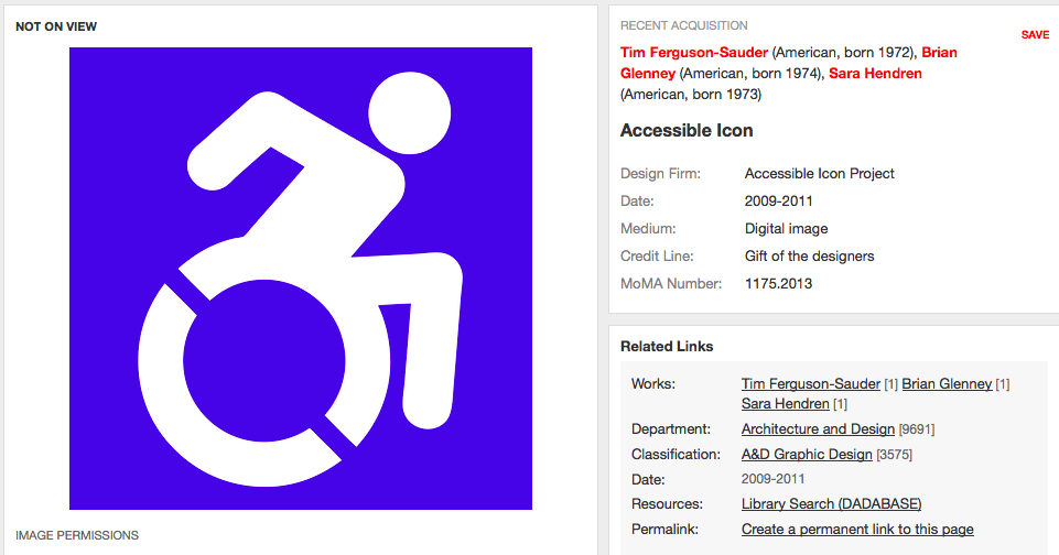
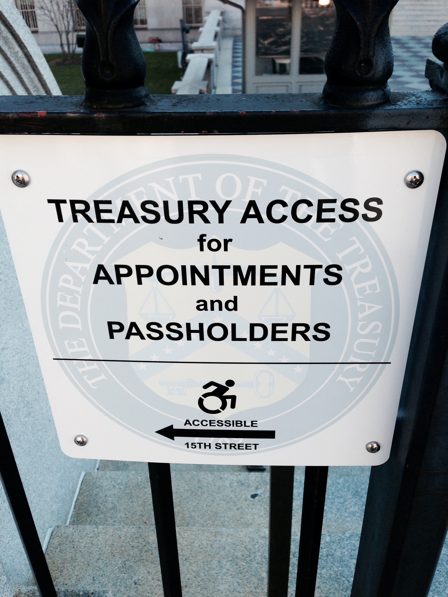
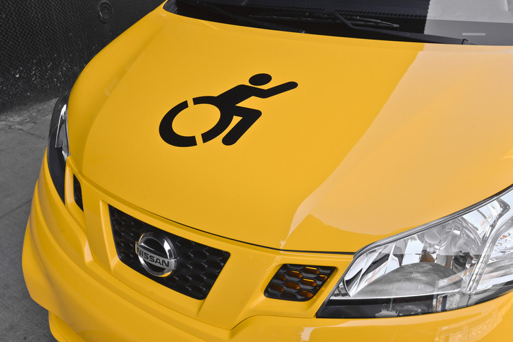
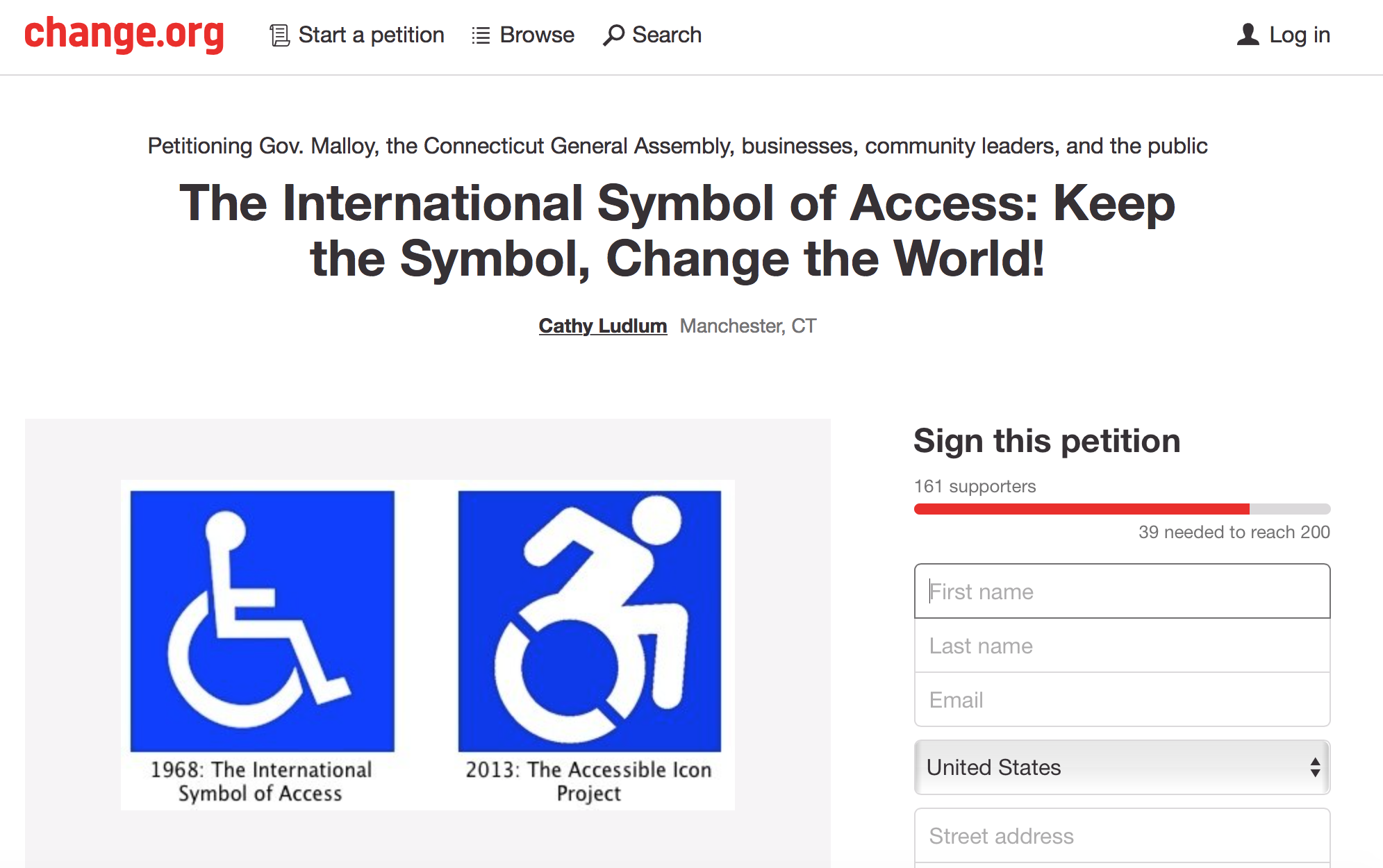
Accessible Icon Final
An opaque symbol of an ISO 50 person leaning forward with wheel cutouts for stenciling and expressing movement.
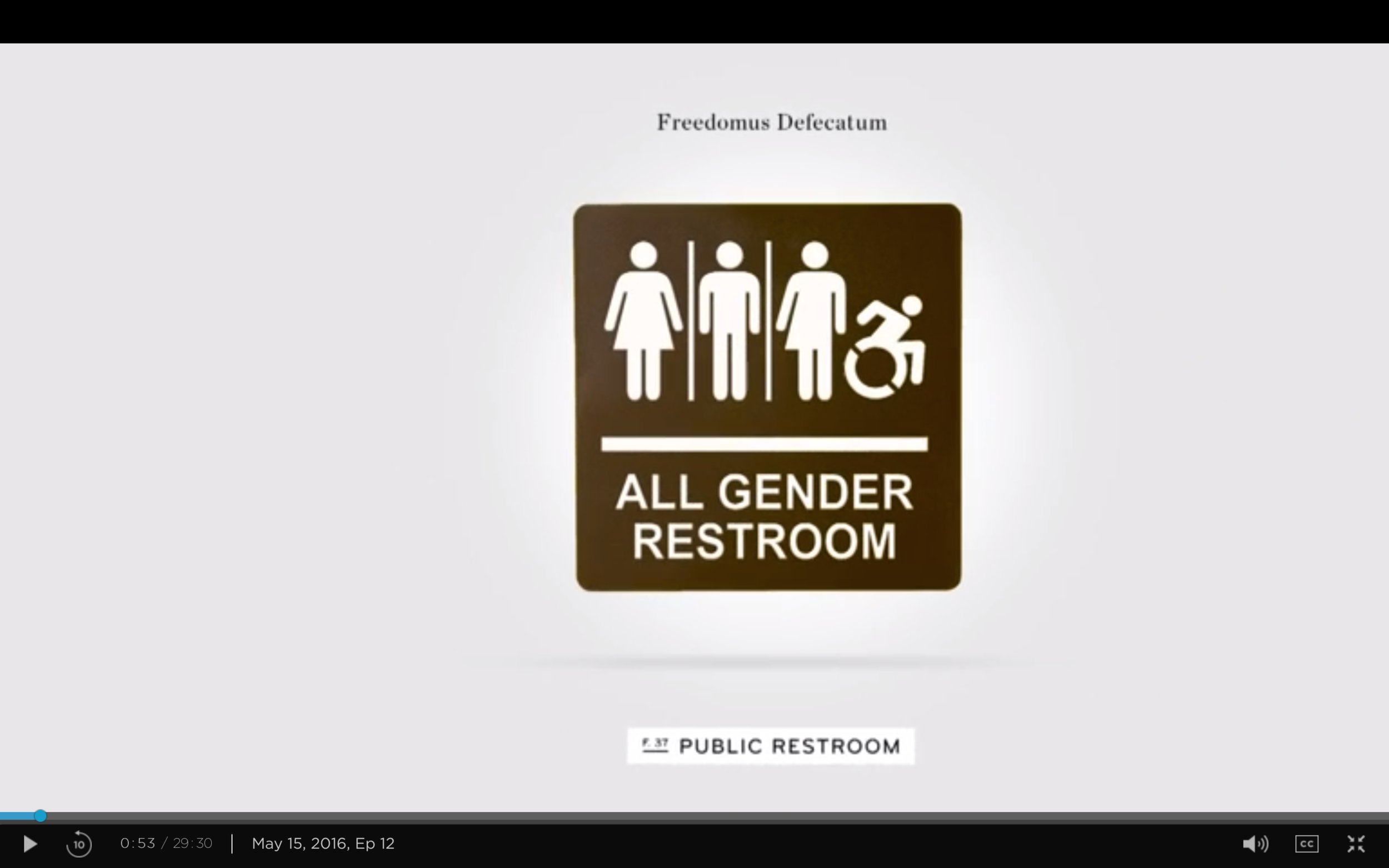
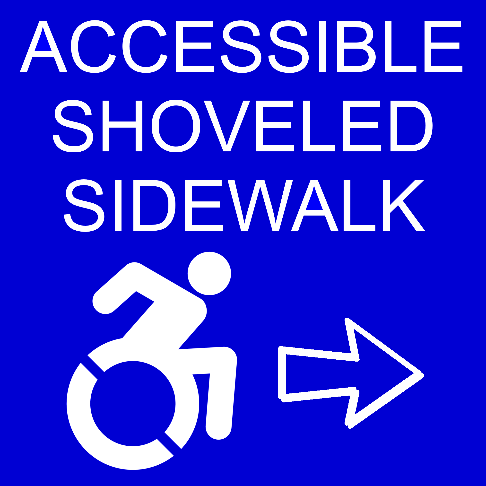
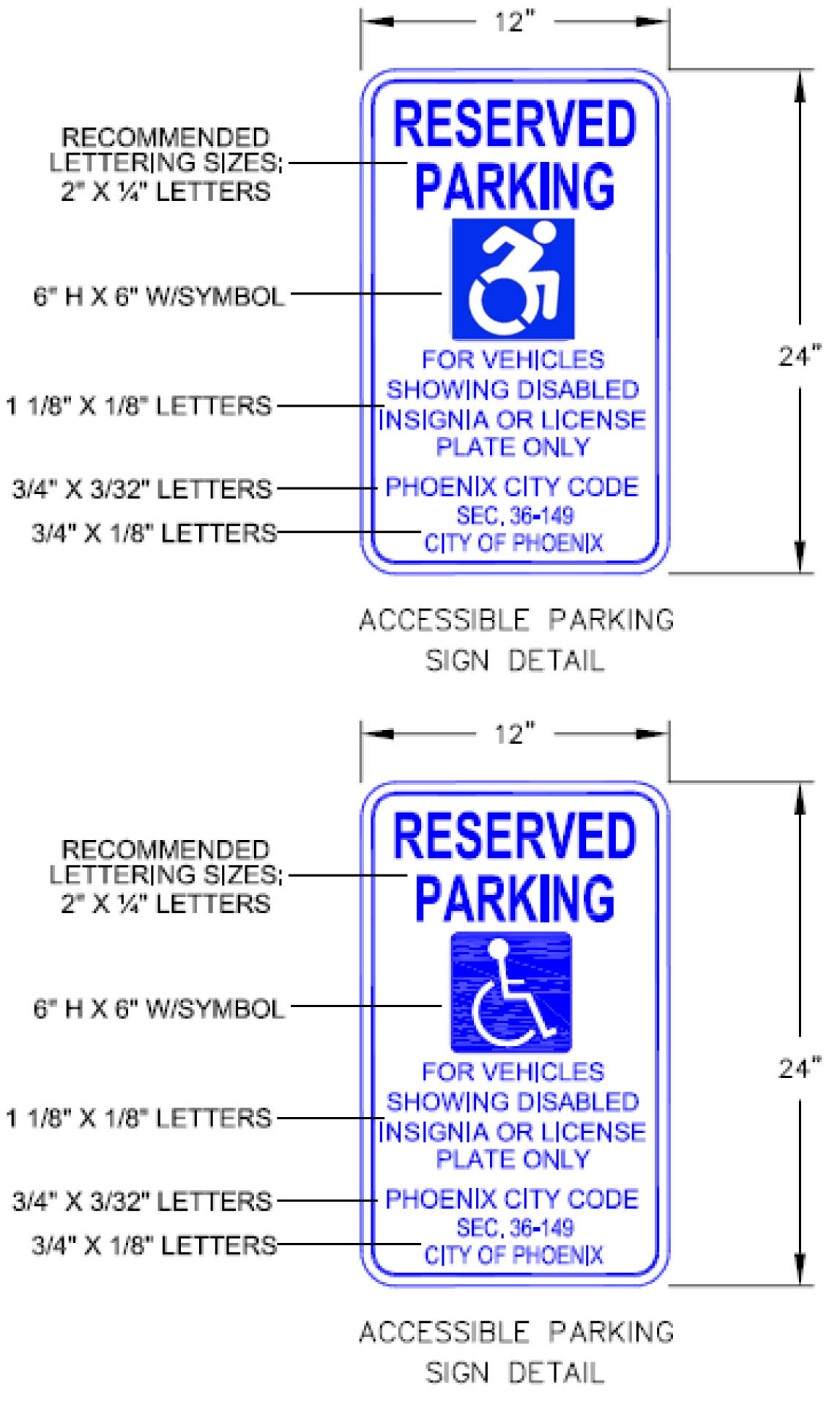
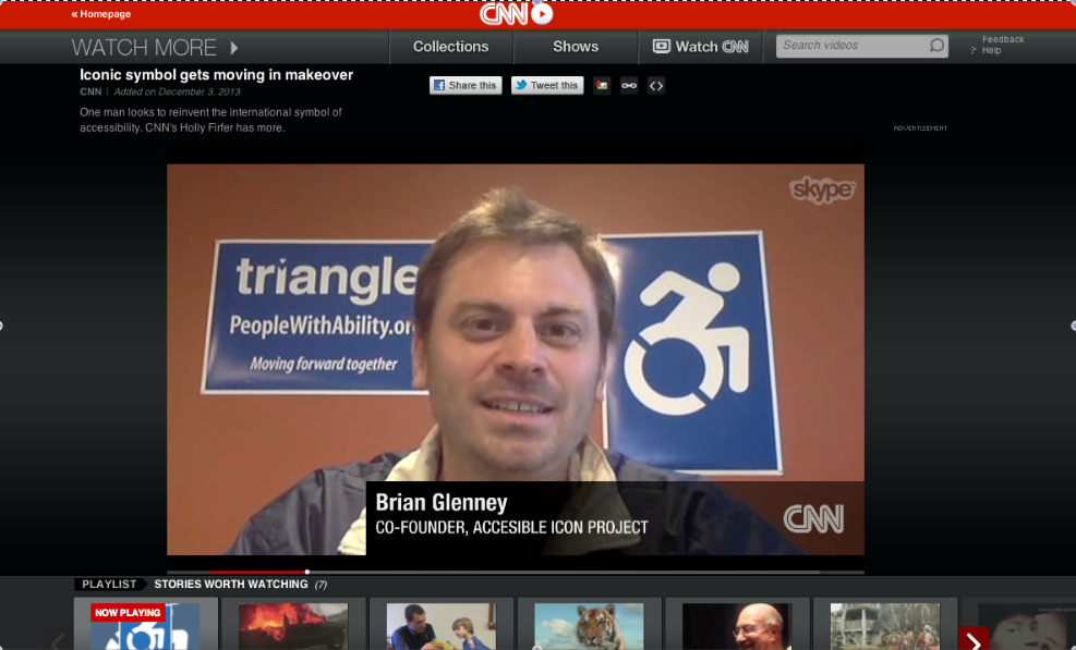
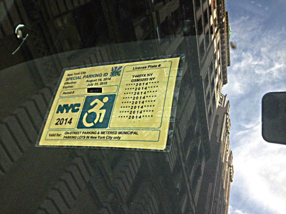
In 2014, this symbol was adopted by the State of New York, accepted into the permanent collection of the MoMA, and got lots of press. By 2016, numerous cities and states had adopted the symbol's use, as well emojis by Apple, Twitter, Microsoft, What's App, the Taxi of Tomorrow, 99% Percent Invisible, among others.
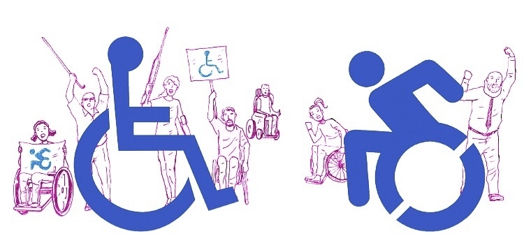
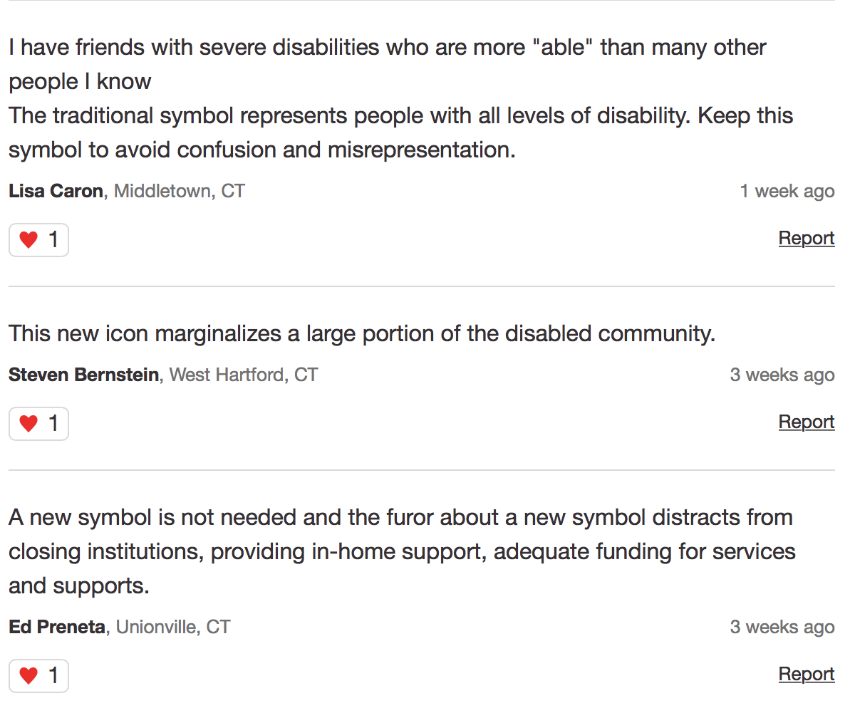
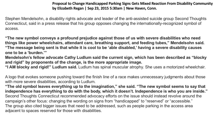
There remains lots of controversy about the use of the symbol by people with disabilities. This is understandable. The icon is a “translational” symbol: it helps translate the notion of “disability” or “access” to an able-bodied population. the federal gov’t has yet to publicly adopted our symbol, and thus it remains legally problematic, (like marijuana laws): legal in states, illegal in the federal government.
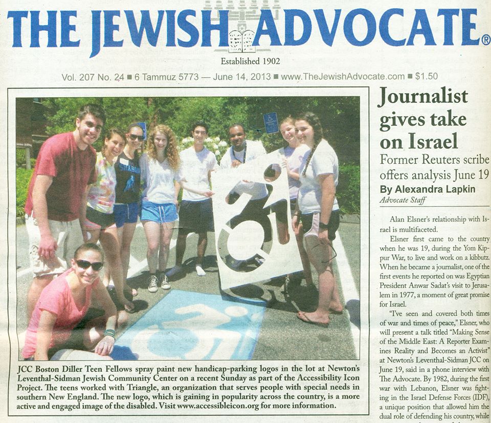
We are continuing to do fun things with the Accessible Icon, and the best part is seeing others take our symbol in new directions.